EquOS
An OS designed to not be used.
Overview
Role
Timeline
Summary
UX Designer
10 weeks
Sep - Dec 2021
Team
At the beginning of fall quarter, our INFO 365: Mobile App Design class was tasked with creating our own operating system and 10+ of its native apps. Additionally, we had to propose a device that would host our operating system. With instructions to be creative and ask questions along the way, we immediately got to work. After 10 weeks of intense work, we presented EquOS!
Anna Shi, UX Designer
Delaney Edwards, UX Designer
Hadar Dolev, UX Designer
Larry Tian, UX Designer
Nicole Fendi, UX Designer
Rachel Chung, UX Designer
Context
With the intention to create balance between real life and technology, EquOS, named after ‘equilibrium,’ was born. When first brainstorming, our group members all shared frustrations of being too connected to our phones and unable to escape their grasp. We wanted to have a device that would support our lives outside of technology, rather than consume it. With these insights, we began to craft our problem statement.
Problem Statement
How might we create an OS that is efficient, yet does not consume users' attention so they can have a balanced relationship with technology?
Design Principles
After discussing the values we wanted to reflect in our design, we decided upon these four guiding design principles.


Minimalistic
Streamlined
Balanced
Reliable
Our Motto
Designed to not be used.
We wanted to give users more freedom to live in the present by creating something that is easy to use, while not increasing temptation or distracting them from the world outside of technology. Our challenge was to use our design principles to minimize interaction, while still being efficient and practical for users.
Research Insights
To understand potential user behaviors and trends, we did some initial user research that helped us grasp the current market. We sent out a survey asking potential users a series of questions about their phone usage and their thoughts on notifications in particular.
70%
of people said that notifications with just the logo and number of notifications are less likely to prompt people to open the app.
60%
of people think their current notification system is somewhat disorganized.
54%
of people feel somewhat annoyed when notifications appear on their phone, especially unimportant ones.
We discovered that the current notification systems presented a problem for many users. It seemed to cause frustration among users, as they are primarily "designed for engagement" and not a desired feature. With these insights, we decided to heavily focus on addressing this issue in our solution.
User Personas
About

Katherine Suwal
The overwhelmed student
Katherine is an overwhelmed college senior. She works part time and wants to make the most out of her last year. She turns to her phone when she is stressed, but ends up spending many precious hours of her day scrolling through TikTok or Reddit.
Needs
-
Wants her phone to help her with everyday tasks instead of distracting her
-
Wants her free time to socialize or relax instead of being on her phone
Pain Points
-
Doesn't like how much time she spends on her phone scrolling social media or checking her calendar
-
Doesn't want to be distracted when checking important information
About

Len Kishimoto
The busy professional
Len is a founder of an up and coming startup company who has a wife and child. He wants to spend more time with them, however he constantly receives work notifications and feels the need to always be on his phone.
Needs
-
Wants to use his free time to be with his family to make more memories
-
Wants his phone to help with work, but not distract him when he is off work with family and friends
Pain Points
-
Feels like he always needs to be replying to emails and getting things done
-
Anxious from his lack of work-life balance and has trouble focusing on what's important to him
Early Ideation
We began by composing a mood board that captured what we envisioned for EquOS. Keeping our design principles of minimalistic, streamlined, balanced, and reliable in mind, we gravitated towards calming colors and simple line work and forms.

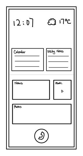
After creating our mood board, we began sketching physical device designs and landing screen ideas. We settled upon a flip phone design that opens up to a full touch screen. We believed that the flip phone created a physical barrier between the user and the screen and promoted disconnecting from the technology when it is not actively being used. We also wanted our landing screen to be the main source of functionality for our users. We decided customized widgets could allow users to have easy access to necessary apps, while hiding other miscellaneous apps that can cause distraction.


Low-fidelity Wireframes
Next, we turned our sketches into basic wireframes and components. These helped us keep our app designs consistent, as we began to divide and conquer.

Final Product
After a few more sprints and lots of feedback from our instructor, we had a high fidelity prototype of EquOS. Below is our final product presented through it's core features!
The Flip Phone
Balanced, Minimalistic
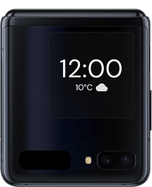
Closing the phone physically separates the user from the technology allowing them to fully live in the moment.
Functions of the small screen:
-
Check the time and weather
-
Change the song
-
Review priority notifications
-
Take a quick photo
Color with a Purpose
Balanced, Minimalistic
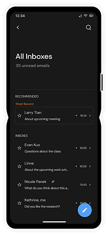
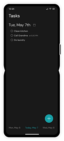
The darker screen makes our device less stimulating; allowing it to be a tool, rather than a distraction.
Our intentional use of color helps users understand the interconnected nature of our apps.
Less is More
Streamlined, Minimalistic
Minimized designs to reduce user interactions while keeping apps efficient.
We only kept the essential features to assist users in accomplishing their goals.
Grayscale
Balanced
To minimize the addictiveness of the phone, our interface will gradually change to a grayscale after 30 continuous minutes to subtly remind users of their screen time.
This encourages users to step away from their phone and into the real world.
Filtered Distractions
Balanced, Reliable
View only important notifications in the "Priority" tab when you open up the notifications panel by double tapping on the home screen.
Distracting and insignificant notifications, such as social media, go to the "Other" tab. Only the app logo and number of notifications are displayed.


